ShopDreamUp AI ArtDreamUp
Deviation Actions


Description
Lala ")
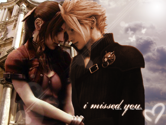
I hate Aerith/Cloud
Not sure why I did it, but enjoy! Gimme any tips if you have any, I'm not sure I did the best with the blending the two images. "Advanced critique" if you will.
Note: If you look closely you will notice that I tried to smudge Cloud's frown into a semi-smile. Or at least not a frown.
Credit.
Sky Image - [link]
Butterflies -
Adam for his wonderful vectorish brushes
ALSO:: I do NOT own the two images, they are characters that belong to Square Enix. They are from Final Fantasy VII.
Image size
640x480px 444.7 KB
© 2008 - 2024 jiLLzz
Comments30
Join the community to add your comment. Already a deviant? Log In
I love this *-* But as you mentioned the critique, then I can't help myself but expressing a few details I noticed :3
-If you make the borders of the characters a little softer, they probably would blend a little more with the background.
- I'm not sure what happened with Cloud's right shoulder, but I think it would be better to have Aerith's shoulder totally in front of him (showing her complete shoulder), so it could look like he's semi hugging her *-*
- And! I don't know if it's just me but I think she looks a little taller than him o.O but anyway, those are detailes that I only noticed after staring at the image for a few seconds more than usual xD
Nice work *-*!